Simplified Compliance Desktop App
Drove 70% user engagement by reducing cognitive load.
Role
UX/UI Designer
Industry
Banking
Duration
3 months

Overview
Data Management module is an internal FATCA platform which helps to identify the errors from the heavy data file which helps user to correct the source data. This module helping financial institutions (banks), AMCs, Mutual funds to clean, validate and modify the data.
Challenge
To improve the design experience of FATCA- CRS process.
Why to file FATCA?
The Foreign Account Tax Compliance Act (FATCA) is tax information reporting regime, which requires Financial Institutions (FIs) to identify their U.S. accounts
Finguine makes FATCA-CRS (Form 61B) compliance easy for financial institutions with tools for validation, reporting, and filing.
Project Objective
To create seamless intuitive platform
To reduce the several clicks and improve the cognitive load that makes interface easier to use and understand.
Core Features
Identifying error and Cleaning error
Create downloadable file.
Accurate tracking, Version Control and preventing confusion during multiple uploads or remediation cycles.
Helps users accurately select the correct files during the data load and processing stage.
Target Audiences
Businessman
Entrepreneur
Investors(People with multiple businesses)
NRI investors
Scope & Assumptions
After deciding the high level subject, a closer scope definition was required. Some part of the full experience has to do more with design, because I wanted to deliberately exclude to avoid dealing with complex issues regarding the much debated topic of the FATCA CRS Compliance tool.
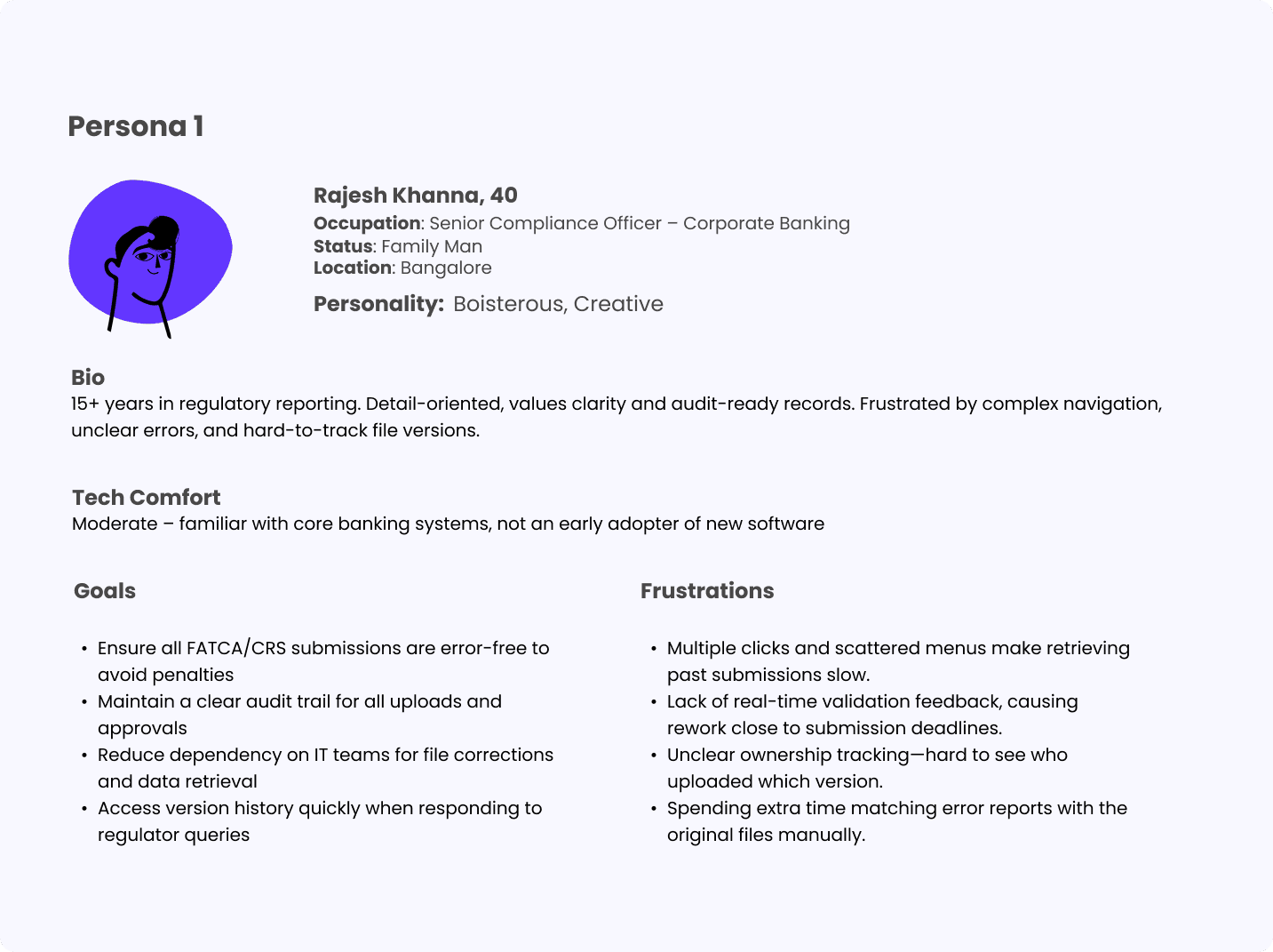
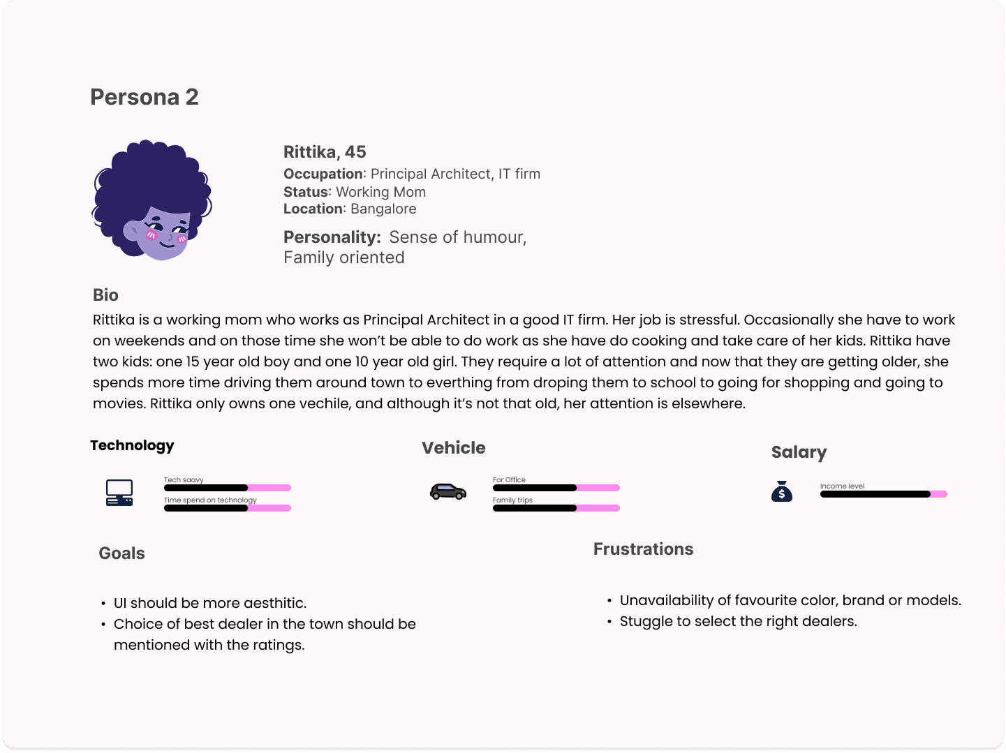
Persona
Based on my understanding and assumptions I have done created two personas to identify their goals and frustations.
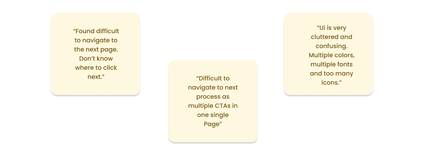
Key Findings from the User POV
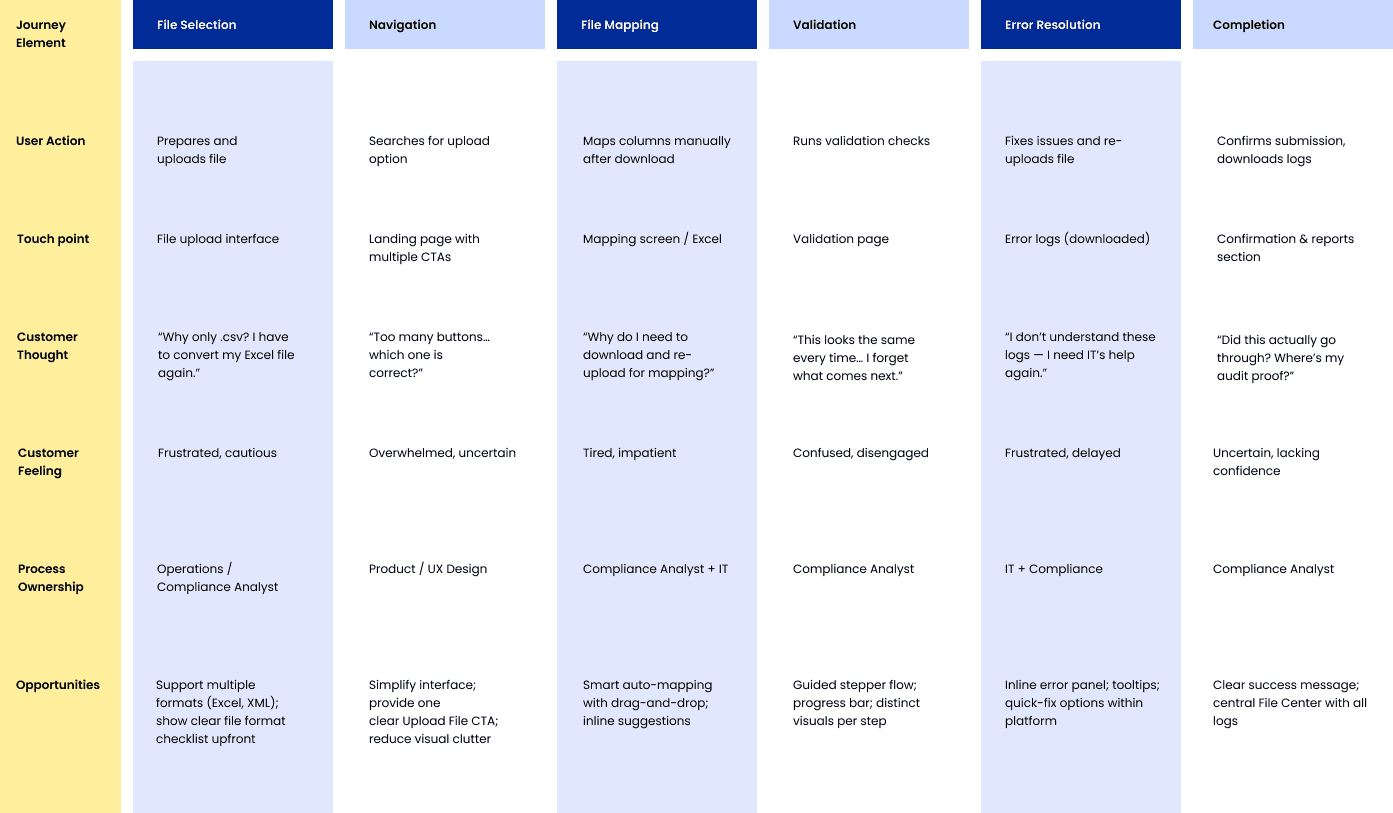
User Journey Mapping
Sketches
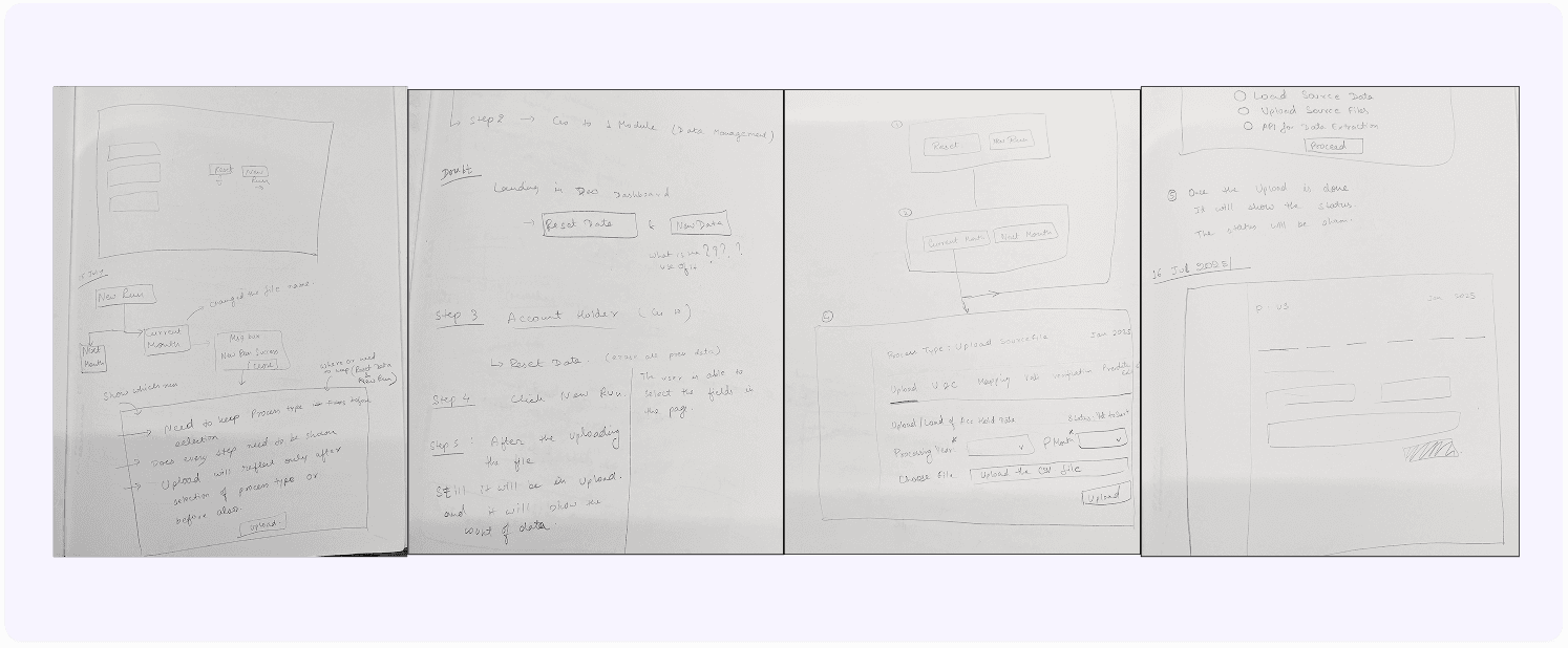
Before Re-Design
Below design needed to transform into something decent. It has so many CTAs, confusing radio buttons, various steps which increase the cognitive load.
So, my approach towards design is:
Break the step by step process.
Improvement in UI to avoid clutter .
Implement better option for downloading multiple file at once.
Improvement in CTAs.
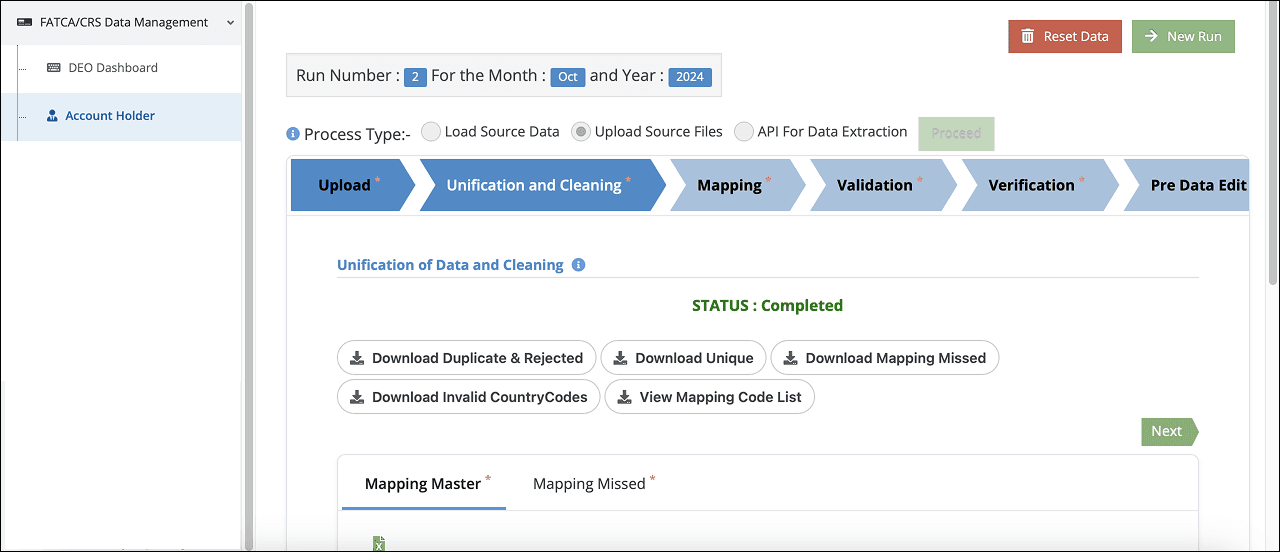
After Re-Design
It was needed to create basic design for the steps. Not everything is worth labelling, so I emphasized a few decisions that were made and how the design solution is justifying them.
Design Features are:
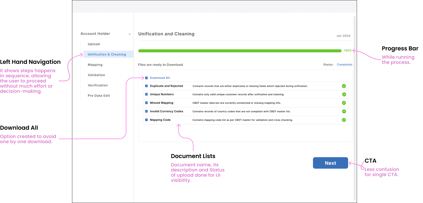
Left Hand Navigation: Here user doesn’t have to worry about what is the next step as all steps are put together respectively in the side navigation. So, when the cycle starts it keeps going automatically in the next steps.
Download All: This feature allows all documents to be downloaded at once with a single click by optimizing the process by eliminating repetitive single-file downloads.
CTA: Single CTA “Next” that focuses on user attention on one clear action, reducing decision fatigue and improving conversion rates.
Progress Bar: It gives user clear feedback about progress happening in the background and also improves trust while waiting for long processes like bulk data upload, validation, and error report generation.
Other projects

Designed Bill Reimbursement Experience
Improved daily billing efficiency for healthcare professionals by 20%

Fintech Website
Reduced bounce rate by 60%

Tatacliq Luxury - UX Case Study
User experience on purchase of authentic luxury products with TATA CLIQ.

Digital Library
Curated a digital library platform to access books, documents, literature online.